Quick Start
This chapter gives an overview of what Roassal is up to. Many short code snippets are provided and briefly described. These snippets are directly copy-and-pastable within Roassal and typically each illustrates one particular aspect of the Roassal tooling.
1. Basic Installation
1.1. From scratch (novice)
Installing Roassal is relatively easy. It is just a matter of downloading a .zip file, available on http://AgileVisualization.com. Unzip the file and execute MooseSuite to immediately start Roassal. Note that your filesystem will not be polluted: the application you have downloaded is all you need.
1.2. Loading from Pharo (for advanced user)
Pharo is a modern object-oriented programming language. If you are a Pharo programmer and want to integrate Roassal into your working developing environment, you may be interested in loading Roassal directly from its repository.
Roassal is available within the Catalog browser, available from the Tools menu entry. In case of you need a Gofer script (if you wish to programmatically load Roassal or create a dependency within your application):
	Gofer it
	    smalltalkhubUser: 'ObjectProfile' project: 'Roassal2';
	    configurationOf: 'Roassal2';
	    loadStable.
Roassal is known to work on Pharo 4.0, 5.0, and 6.0.
1.3. Linux Ubuntu Users
Roassal relies on Cairo to render visualization. While the Pharo virtual machine is shipped with the Cairo library for the Mac OSX and Windows platforms, linux users need to install it manually. This is easily done with the following incantation:
$ sudo apt-get install libcairo2:i386
Note that you need administrator access grant the Cairo library installation. You will need to manually install Cairo if you are using Ubuntu, Debian, or a fork such as Mint.
1.4. Roassal on VisualWorks
Roassal is available on the public Cincom Store, under the bundle roassal2-full. Note that you need to have Cairo installed from your VisualWorks distribution.
2. Running Roassal
Dragging-and-dropping the file moose.image on the virtual machine opens the Moose programming environment. Moose is a platform for data and software analysis. Roassal is the visualization engine part of Moose. Moose and Roassal are written in the Pharo programming language.
3. First visualization
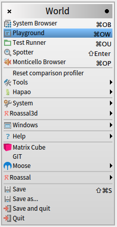
Most of the visualizations given in this book are written as a short script. A playground is a tool offered by Pharo to execute script. A playground may be open from the World menu (i.e., the menu you get when you click outside a Pharo window):
Open a playground and type the following (or copy if you are using an online version of the book):
	b := RTMondrian new.
	b shape label.
	b nodes: (1 to: 100).
	b edges connectFrom: [ :i | i // 2 ].
	b layout cluster.
	b
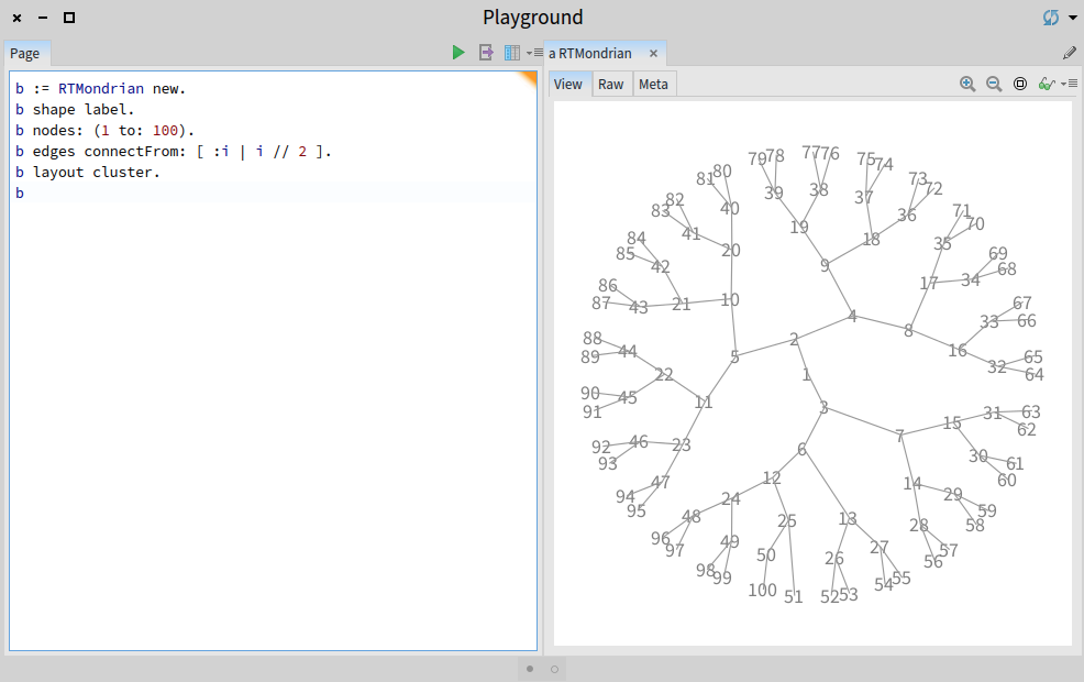
Press the Do it all and go button, represented with a green triangle, on the top right of the Playground window. Alternatively, select the whole content of the playground with Ctrl-A or Cmd-A and press Ctrl-G or Cmd-G. You should obtain Figure 3.2.
Mondrian is a high level code library for building expressive and flexible visualizations. After selecting the Mondrian library, the script selects the label shape. Nodes are then created, numbered from 1 to 100. Edges are built as follows: for each number i between 1 and 100, an edge is created from the element representing i // 2 and i. The expression a // b returns the quotient between a and b, e.g., 9 // 4 = 2 and 3 // 2 = 1.
Nodes are then ordered as a cluster layout. Each element is draggable and has a popup with the mouse.
4. Visualizing the file system
We will reuse the previous visualization to visualize a file system instead of arbitrary numbers. Pharo offers a large library to manipulate files and folders. Integrating files in a Roassal visualization is easy. Consider the following script:
	path := '/Users/alexandrebergel/Documents'.
	allFilesUnderPath := path asFileReference allChildren.
	b := RTMondrian new.
	b shape circle
	  color: Color gray trans;
	  if: [ :aFile | aFile path basename endsWith: '.pdf' ] color: Color red trans.
	b nodes: allFilesUnderPath.
	b edges connectFrom: #parent.
	b normalizer
	  normalizeSize: #size min: 10 max: 150 using: #sqrt.
	b layout cluster.
	b
The variable path contains a location in your file system. You need to change the path to execute the script. Please note that indicating a large portion of the file system may significantly increase the computation time. The expression path asFileReference converts a string indicating a path as a file reference. FileReference is a Pharo class that represents a file reference, typically locally stored, on the hard disk. The message allChildren gets all the files recursively contained in the path. The visualization paints in red files for which their name ends with .pdf.
Compared with the previous example, this visualization uses a normalizer to give a size to each circle according to the file size. The size varies from 10 to 150 pixels, and uses a square root (sqrt) transformation to cope with disparate size. You may want to click on the camera center icon button just above the visualization to scale it down.
As a small exercise, you can replace #sqrt by [:s | (s + 1) log * 2 ], for a logarithm scale, or #yourself for a linear scale.
5. Geographical CSV data
Comma-separated values (CSV) is a file format commonly manipulated by spreadsheet applications, such as Excel. Roassal has facilities to easily extract data from CSV files. The following example shows earthquakes over the last 30 days:
	tab := RTTabTable new input:  'http://earthquake.usgs.gov/earthquakes/feed/v1.0/summary/2.5_month.csv' asUrl retrieveContents  usingDelimiter: $,.
	tab removeFirstRow.
	tab replaceEmptyValuesWith: '0' inColumns: #(2 3 4 5).
	tab convertColumnsAsFloat: #(2 3 4 5).

	b := RTMapLocationBuilder new.
	b shape circle
		size: [ :m | 2 raisedTo: (m - 1) ];
		color: (Color red alpha: 0.3).
	tab values do: [ :row | b addPoint: row second @ row third value: row fifth ].
	b
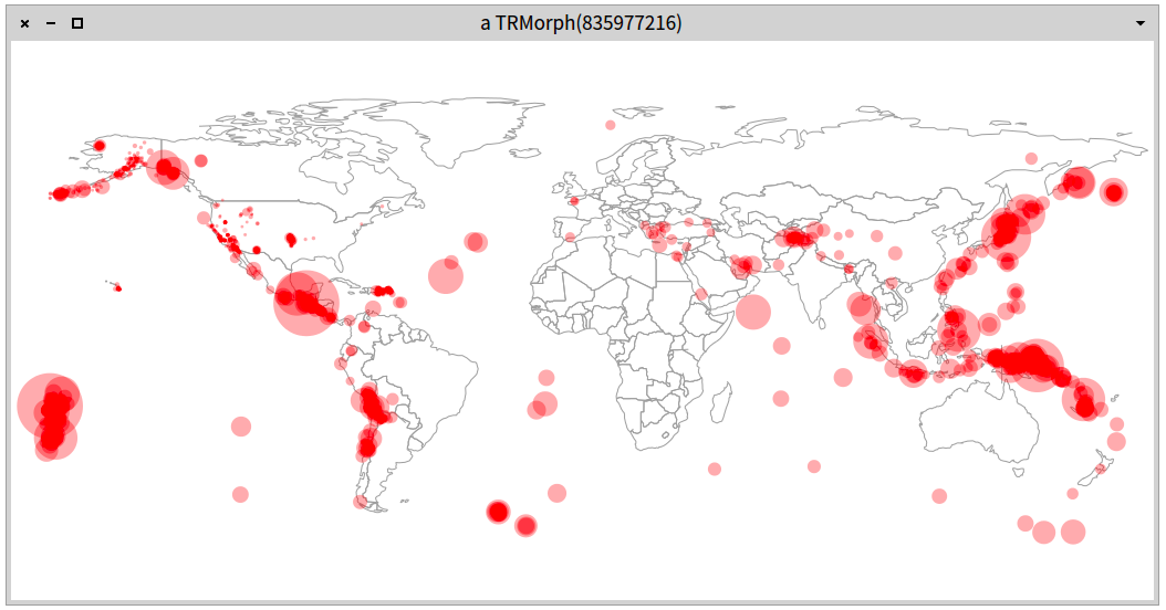
Sending the message asUrl to a string returns an instance of the class Url, describing urls. The content of the url is obtained by sending retrieveContents. For example, if you wish to know what google.com is made of, inspect the following expression: 'http://google.com' asUrl retrieveContents.
The data visualized in the previous example is from the US Earthquake Hazards Program (http://earthquake.usgs.gov/earthquakes/feed/v1.0/). The retrieved data looks like the following lines:
'DateTime,Latitude,Longitude,Depth,Magnitude,MagType,NbStations,Gap,Distance,RMS,Source,EventID,Version
2014-07-31T12:56:24.800+00:00,38.741,-122.714,1.2,0.9,Md,8,112,,0.04,nc,nc72268926,1406813044917
2014-07-31T12:49:08.000+00:00,67.655,-162.002,15.5,3.5,ml,,,,0.65,ak,ak11344820,1406813786856
2014-07-31T12:49:01.000+00:00,59.713,-142.589,99.9,1.4,ml,,,,5.95,ak,ak11344819,1406813766175'
Making that bunch of data exploitable requires a number of conversions and manipulations. The class RTTabTable is made to convert and extract values from the data. We first remove the header ('DataTime,Latitude,...'). Empty values are converted with '0'. Portion of the data matching ',,' is transformed into ',0,'. Since the table is composed of string characters, we need to convert them as numerical floats. Column 2, 3, 4, and 5 are converted into float numbers (i.e., decimal numbers, such as 4.5). We create a RTMapLocationBuilder, which will be fed with the extracted values. We create a new shape, which is a transparent circle. The radius of each circle represents an earthquake of magnitude m, given by 2m - 1. This formula is rather arbitrary but it gives an intuitive output.
6. Seism activity over time
Timelines are useful abstractions to communicate evolution of particular properties or metrics over the time. Using the same example, the following script produces a time line of the earthquakes (Figure 6.1):
	tab := RTTabTable new
			input: 'http://earthquake.usgs.gov/earthquakes/feed/v1.0/summary/2.5_month.csv' asUrl retrieveContents
			usingDelimiter: $,.
	tab removeFirstRow.
	tab convertColumn: 1 to: [ :s | (DateAndTime fromString: s) julianDayNumber ].
	tab convertColumnsAsFloat: #(5).

	v := RTView new.
	es := RTEllipse elementsOn: tab values.
	v addAll: es.
	es @ RTPopup.

	RTMetricNormalizer new
		elements: es;
		normalizeColor: #fifth using: { Color orange . Color red };
		alphaColor: 0.3;
		normalizeX: #first min: 0 max: 600;
		normalizeSize: #fifth min: 0 max: 80 using: [ :mag | 2 raisedTo: (mag - 1) ].

	es @ (RTLabeled new text: [ :row | row fifth > 6 ifTrue: [ row fifth ] ifFalse: [ '' ] ]).
	v @ RTDraggableView.
	v

The first column is converted into Julian day numbers. This is useful for ordering the earthquakes later on. The fifth column is then converted as a float. A circle is associated with each entry of the table. The size of each ellipse and its colors is deduced from the fifth column (earthquake magnitude). The first column, the Julian day number, is used to horizontally order the ellipse. Each earthquake with a magnitude greater than 6 has a title.
The Julian Day Number (JDN) is the number of elapsed days since the beginning of a 7,980-years cycle. This number is frequently used by astronomer. The starting point for the first Julian cycle began on January 1, 4713 BC.
7. Charting
Roassal has a sophisticated mechanism to draw charts. Grapher takes as input a set of data points and a configuration (which may be minimal) to render these data points.
7.1. Plotting
The following example illustrates Ebola outbreaks (Figure 7.1):
	"Preparing the data"
	tab := RTTabTable new input: 'http://agilevisualization.com/Ebola2.csv' asUrl retrieveContents usingDelimiter: $,.
	tab removeFirstRow.
	tab replaceEmptyValuesWith: '0' inColumns: #(10 11).
	tab convertColumnsAsInteger: #(10 11).
	tab convertColumnsAsDateAndTime: #(3 4).
	data := tab values reversed.

	"Charting the data"
	b := RTGrapher new.

	ds := RTData new.
	ds interaction fixedPopupText: [ :row | row value at: 12 ].
	ds dotShape ellipse
		color: (Color blue alpha: 0.3);
		size: [ :row  | (row at: 11) / 5 ].
	ds points: data.
	ds connectColor: Color blue.
	ds y: [ :r | r at: 10 ].
	ds highlightIf: [ :row | (row at: 10) > 100 ] using: [ :row | row third year ].
	b add: ds.

	b axisX noLabel; numberOfTicks: tab values size.
	b axisY noDecimal.
	b
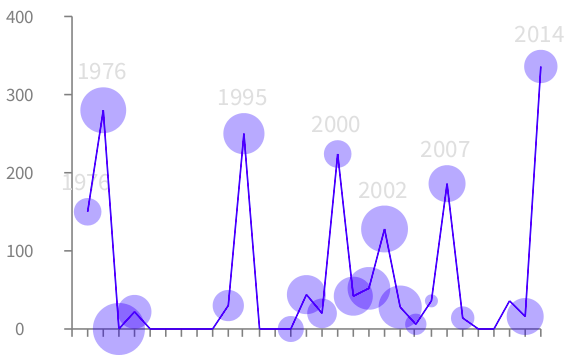
Figure 7.1 gives the output of the script. The Y-axis represents the number of fatalities. The X-axis is the sequential events. Note that time is not scaled in this chart, as the data are simply stacked from left to the right. The size of an event gives the rate of fatalities. Locating the mouse above an event gives some contextual information.
The CSV data is obtained from a short bit.ly link we have set for the purpose of keeping the script short. The original data comes from the website http://mapstory.org. MapStory is a website with short and illustrative stories. Outbreaks are contained in the file in a reverse chronological order, which is why we first reverse order it. Each point is a row in the table. The use of fixedPopupText: opens a popup for each data point when the mouse is above the data point. Column 12 of a row is a description of the outbreak.
Each data point is a circle. Its size reflects the value of the column fatality rate (% of death per contamination). The column 10 indicates the number of fatalities. This value is used on the Y-axis. Only major events are labeled with the year (the third column corresponds to the year of the outbreak).
7.2. Double charting
Charter offers several visualization types. A double bar chart is an effective visual representation for small datasets and with two metrics to be represented. Consider the following example that illustrates the distribution of people in North American states (Figure 7.2).
	tab := RTTabTable new input: 'http://bit.ly/CensusGov' asUrl retrieveContents usingDelimiter: $,.
	tab removeFirstRow.
	tab convertColumnsAsInteger: #('POPESTIMATE2013' 'POPEST18PLUS2013').

	b := RTDoubleBarBuilder new.
	b pointName: [ :row | row at: (tab indexOfName: 'NAME') ].
	"Remove the first line, the sum"
	b points: tab values allButFirst.
	b bottomValue: [ :row | ((row at: (tab indexOfName: 'POPESTIMATE2013')) / 1000) asInteger ]
		titled: 'Pop estimate (x 1000)'.
	b topValue: [ :row | ((row at: (tab indexOfName: 'POPEST18PLUS2013')) / 1000) asInteger]
		titled: 'Pop +18 estimate (x 1000)'.
	b
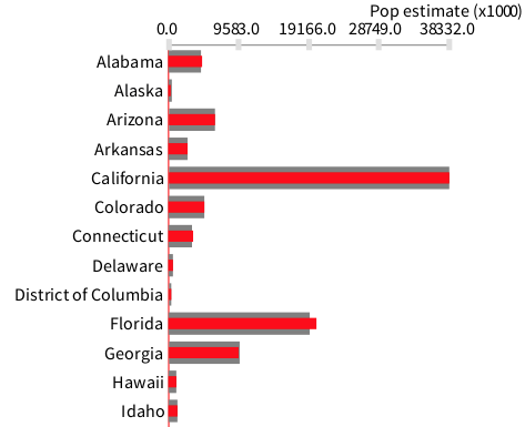
Data are obtained from http://census.gov, a wonderful source of social data. Some columns are converted as numerical integers. Rows are then provided to the builder b. The first line is removed since it contains the value for the whole United States, which would distort the visualization.
7.3. Multiple graphs
Several graphs may be represented simultaneously. Consider the following example (Figure 7.3):
	b := RTGrapher new.
	numberOfDataSets := 5.

	colorNormalizer := RTMultiLinearColorForIdentity new
						objects: (1 to: numberOfDataSets).
	1 to: numberOfDataSets do: [ :i |
		ds := RTData new.
		ds noDot.
		ds points: ((1 to: 500) collect: [ :ii | 50 atRandom - 25 ]) cumsum.
		ds connectColor: (colorNormalizer rtValue: i).
		b add: ds.
	].
	b
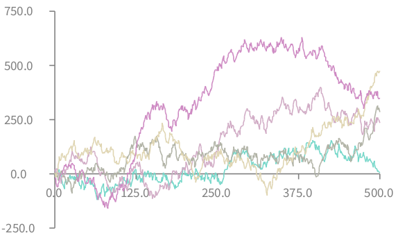
The variable numberOfDataSets indicates the amount of data points we randomly generate. The variable colorNormalizer points with a color normalizer. The job of a color normalizer is to associate an object to a color. In this case, objects are numbers, ranging to 1 to numberOfDataSets. The default color palette is used.
Data points are obtained by summing random values from 1 to 500 and using a cumulative sum. We remove the dots (using noDot) to solely have line curves.
8. Timeline
Timelines are essential when representing process executions. A Gantt chart is commonly employed to represent project development and implementation. Consider the following script (Figure 8.1):
	data := #(
		#(WP1 0 4)  #(WP2 4 8)
		#(WP3 8 12) #(WP4 3 4)
		#(WP4 7 9) #(WP4 10 12)
	  ).
	b := RTTimeline new.
	s := RTTimelineSet new.
	s objects: data.
	s lineIdentifier: #first.
	s start: #second.
	s end: #third.
	b add: s.
	b axisX
		noDecimal;
		title: 'Month';
		numberOfLabels: 12.
	b
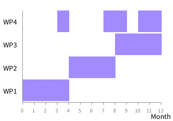
Objects that will be represented are given by the variable data. Each object is represented as an array of 3 elements, for example #(WP1 0 4). The name of an event is given by the first element of the array. The beginning of an object is given by the second element of the array and the event end by the third position. There is no need to have decimal values on the X-axis since only integer values are considered here.
9. Integration with OpenStreetMap
OpenStreetMap is a collaborative project to create maps (http://openstreetmap.org). One of the advantage of OpenStreetMap is that it offers an API to access and download map tiles.
Consider the following example that associate bar charts to some geographical location (Figure 9.1):
	v := RTView new.
	v @ RTDraggableView.
	map := RTOSM new.
	v add: map element.

	"City geographical positions obtained from Wikipedia"
	paris := 48.8567 @ 2.3508.
	newyork := 40.7127 @ -74.0059.
	london := 51.507222@ -0.1275.

	"Some arbitrary data"
	data :=
		{ { paris . #(10 5 10 3 10 6 8) } .
			{ london . #(5 3 3 -5 ) } .
			{ newyork . #(5 -2 10 15 -10) } }.

	data do: [ :tupple |
			| grapher dataSet |
			grapher := RTGrapher new.
			grapher extent: 150 @ 100.
			dataSet := RTData new.
			dataSet points: tupple second.
			dataSet barShape width: 10; color: Color red.
			grapher add: dataSet.
			grapher build.

			barElements := grapher view elements.
			v addAll: barElements.
			barElements translateTo: (map latLonToRoassal: tupple first) ].

	v canvas camera translateTo: (map latLonToRoassal: paris).
	v canvas camera noInitializationWhenOpen.
	v canvas camera scale: 0.3.
	v
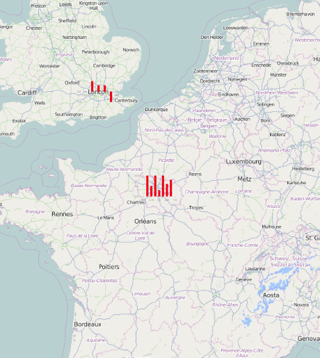
After a basic initialization, data are plotted as a bar chart on top of the tiles. Zooming in and out apply on both the map and the graph. The view initially focuses on Paris, when opened.
Roassal supports a wide range of charts. Another example is (Figure 9.2):
	v := RTView new.
	v @ RTDraggableView.
	map := RTOSM new.
	v add: map element.

	"Place to set the data and center the camera"
	london := 51.507222@ -0.1275.

	"Some arbitrary data"
	data := ((1 to: 500) collect: [ :i | 50 atRandom - 25 ]) cumsum.

	"We build the graph"
	b := RTGrapher new.
	b extent: 100@30.
	d := RTData new.
	d noDot.
	d connectColor: Color red.
	d points: data.

	b add: d.
	b axisY
		labelFontHeight: 6;
		color: Color red;
	    title: 'Sale'.

	b axisX color: Color red; noTick; title: 'country'.
	b build.
	elementsAndEdges := b view elements, b view edges.

	"We create a white background"
	whiteBackground := (RTRoundedBox new color: Color white trans; borderRadius: 10) element.
	v add: whiteBackground.
	v addAll: elementsAndEdges.
	RTNest new on: whiteBackground nest: elementsAndEdges.
	whiteBackground translateTo: (map latLonToRoassal: london).

	v canvas camera translateTo: (map latLonToRoassal: london).
	v canvas camera noInitializationWhenOpen.
	v canvas camera scale: 1.5.
	v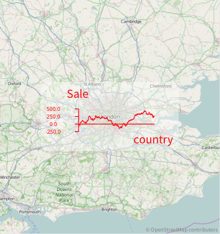
10. More examples
Many examples are available within the Roassal distribution. The Roassal example browser is available from the World menu. Over 1,000 examples are available (Figure 10.1).
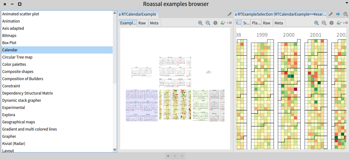
Most of the examples given above use a dedicated builder. Builders are a high level abstract on top of the Roassal low-level API. Part I of the book focuses on the core of Roassal, and covers this low-level API. Part II of the book details the builder mechanism. Part III presents some large applications of Roassal.