Network Latency
Nowadays, people spend a lot of time using electronic gadgets such as computers, smartphones or tablets. As time goes by, all of these devices seem useless without Internet connectivity. Users always want to improve their experience while using Internet services. They acquire Internet connections with the highest bandwidth possible; they buy the phone which promises the fastest connectivity by using 4G; and they sign up for residential fiber-optic Internet. All of these options ar eexpected to offer the best experience. However, there is a hidden element that can affect user experience that most users do not consider, which is network latency.
This chapter is written by Leonel Merino (merino@inf.unibe.ch), PhD student from the University of Bern.
1. Prelude
The latency of a network is the sum of the latency added by every node that takes part in a network communication. Each network node has an inherent latency, specified by its manufacturer. The latency of a network node ---such as a router, a switch, a hub--- is the time elapsed from the moment when it receives a packet and when it sends a response. The path between two computers in a network is dynamic and normally implies several hops through intermediate nodes. Therefore, the latency of a connection will depend on the path that it takes. The range of network latency in Internet are normally in the order of milliseconds. Since the latency is a base delay in each connection, protocols that open many connections are more affected. In consequence, services such as music, video and online games which typically split data into a bunch of small packets are more sensitive to high latency.
1.1. Motivation
When a node of the network fails, the communication paths that pass by the node increase their latency (the impact depends on the nature of the failure). From the point of view of the company which offers the Internet service, there is a need for monitoring how is latency levels among the nodes of the network. In case of a failure, the nodes may react and take corrective actions. Visual tools are extensively used for monitoring services. They allow operators to spot failures at a glance, or in other cases to be aware of how close the latency is to the threshold the user experience is compromised.
1.2. Case study
In our case study we analyzed a proxy service that operates 145 nodes distributed in different cities around the world. By using Roassal we developed a tool for visualizing the status of the service. We called the tool Network Latency Visual Analyzer (NLVA). The tool envisions two kinds of users: a company that manages a network and clients of that company. The tool offers different views of the dataset which helps the company to be aware of failures (to spot where possible failures occurred and what potential users can be affected); to take actions for improving the service by highlighting nodes that are geographically close but that have a high latency ---in comparison with the rest of them--- allowing the company to possibly change the service provider between those nodes; and to spot where the best endpoints are for each node that offers the lowest latency, which can be of help to end users ---e.g., a gamer who wants to know to which server should he connect to minimize the lag.
2. Network Latency Visual Analysis in a Nutshell
When developing NLVA we did not want to start from scratch. We thought that the MapBuilder example, which comes with Roassal offers many of the features that we wanted to have in this tool. However, we decided not to directly modify it or to replicate its code. We reused it by extending some parts of it to fit our purpose. The package NetworkLatency contains the NLVA implementation, made of six classes: NLCityBuilder, NLMapBuilder, NLPopup, NLRoute, NLRouteBuilder, and NLVisualise.
All of these classes except NLVisualise extend a Roassal counterpart. We follow this naming convention RTClassName —> NLClassName. These classes add or modify features of the original MapBuilder implementation. The remaining class NLVisualise is the entry point to run the visualization. It is the main class that holds methods to retrieve the dataset, to trigger ping commands in the local machine, and to build the visualization.
2.1. Resources
NLVA comes with a dataset that contains a snapshot of the latency between servers of a network. It also includes the location (lat/long) of the cities highlighted in the visualization. In addition, it holds IP addresses that are physically located in each city (used when testing user local connectivity). These data were collected from the following sites:
| Resource | URL |
|---|---|
| Network Latency dataset | https://wonderproxy.com |
| IP Location | http://www.iplocation.net |
| Geolocation | http://www.latlong.net |
2.2. Visual Queries
The following queries are examples showing that a visualization of the dataset provides a quick notion of the answer that can be followed by a detailed analysis of the latency measures. At the end, it can help to exclude candidates from the set of possible answers, narrowing the space of solutions. As an exercise the reader can surely find more queries that can be supported by the different views included in the tool.
- Where should a company using this network store content for delivering to users in Paris? (Hint: Best)
- Do you notice some possible failures in the network that may impact the latency? (Hint: Worst)
- Are cities with better connectivity distributed equally in both hemispheres? (Hint: Average)
- What are the cities where the company should invest to improve overall network latency? (Hint: CloseHigh)
- If you want to provide a service in both the US and Europe (using this network), where would be the best two cities to locate a host? (Hint: FarLow)
- If I am in the Paris, to which continents should I prioritize connections?. How would my service be affected if a move it from Paris to New York? (Hint: Left-click on a city)
- How is the network latency in general from my city? (Hint: Right-click on your city if listed or in another region of a country)
- Would I improve my connectivity using the service from which the dataset comes (over my actual provider)? (Hint: Comparing the results of left and right click if your city is included in the visualization)
3. Loading NLVA
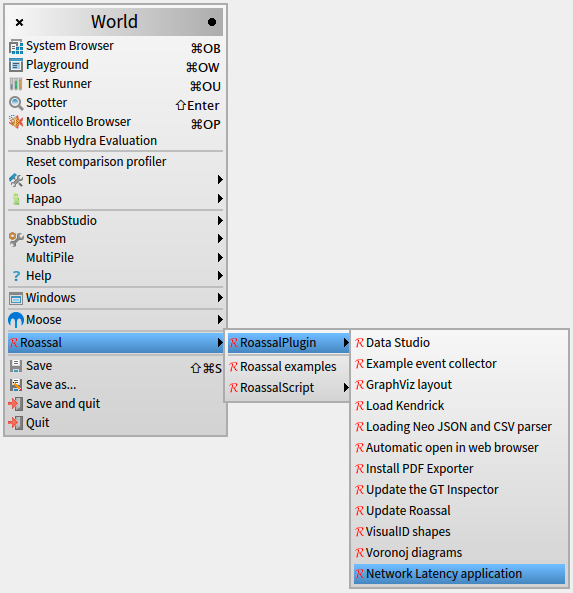
There are two ways to load NLVA. It can be loaded using using the NetworkLatency plugin, accessible from the World menu (Figure 3.1).
Programmatically, you can load it using a Gofer expression, executed in a Playground. Simply copy & paste the following expression in a Playground, and evaluate it:
	Gofer new smalltalkhubUser: 'merino'
		project: 'NetworkLatency';
		package: 'ConfigurationOfNetworkLatency';
		load.
	(Smalltalk at: #ConfigurationOfNetworkLatency) loadDefault
Afterwards, you launch the tool by evaluating:
NLVisualise new open
4. Visualizing latency in a proxy service
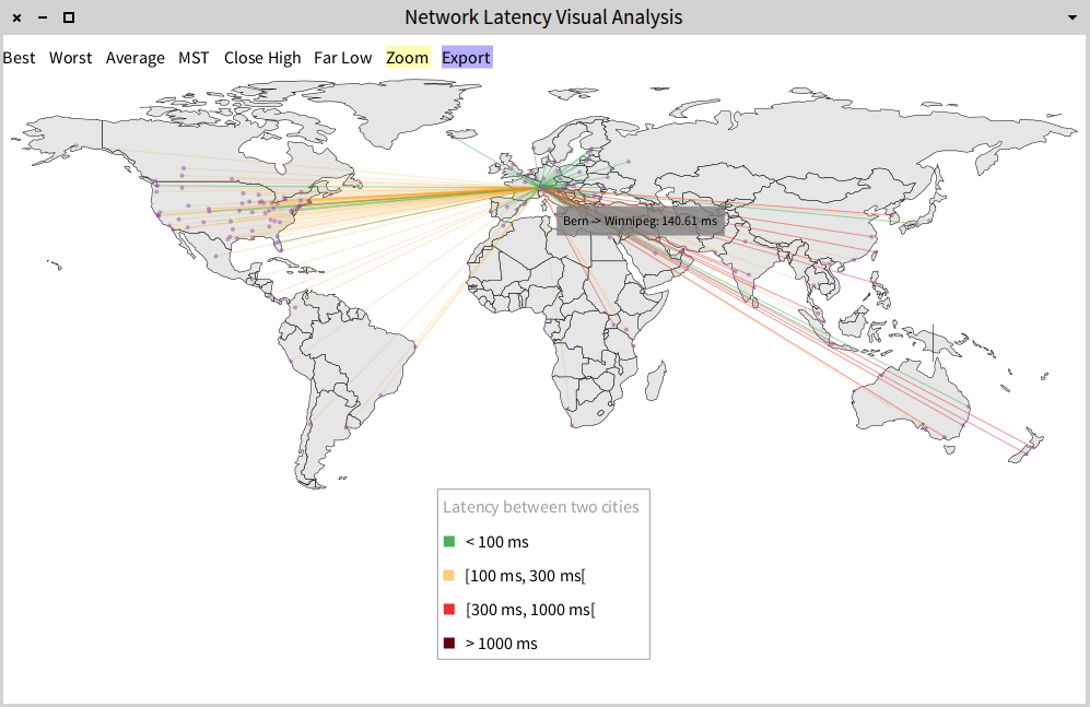
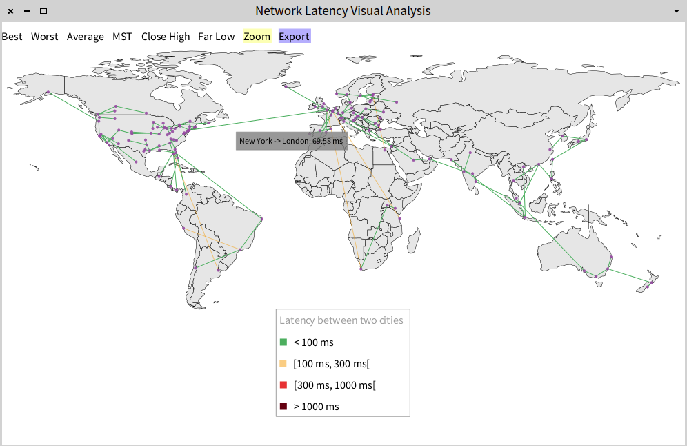
NLVA shows a visualization of a map of the world highlighting 145 cities spread over 70 countries (purple circle). NLVA comes with several views of the data shown in a menu at the top of the window that helps to move from different views such as 'Best', 'Worst', 'MST' (Minimal Spanning Tree), 'Close High' and 'Far Low'. The default view is 'Best', which shows where the city is with which it has the best connectivity (in terms of latency). The color of the edge between the cities represents the latency of the connection. Green edges are the best connections; orange edges indicate an average quality, red ones are worse, and dark red edges indicate the worst latencies (the ranges are split in [0,100ms[, [100ms, 300ms[, [300ms, 1000ms[ and greater than 1000ms).
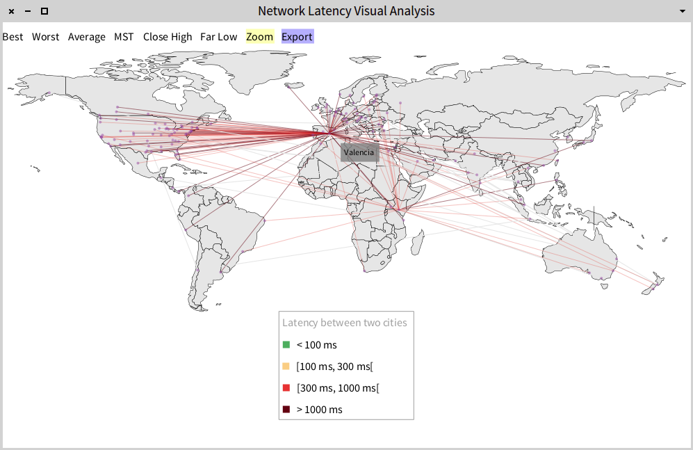
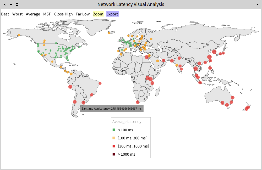
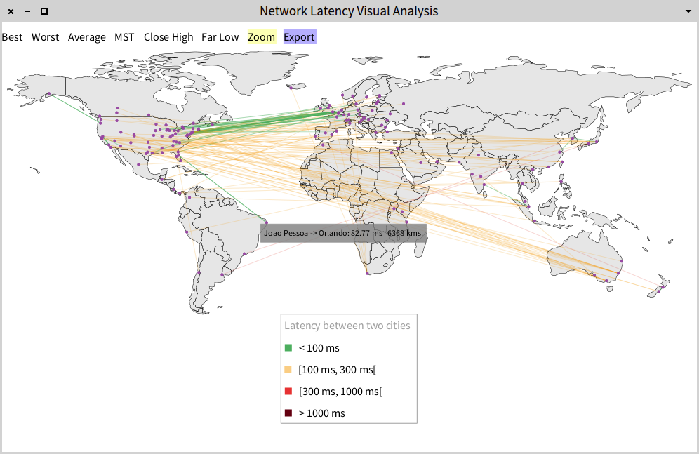
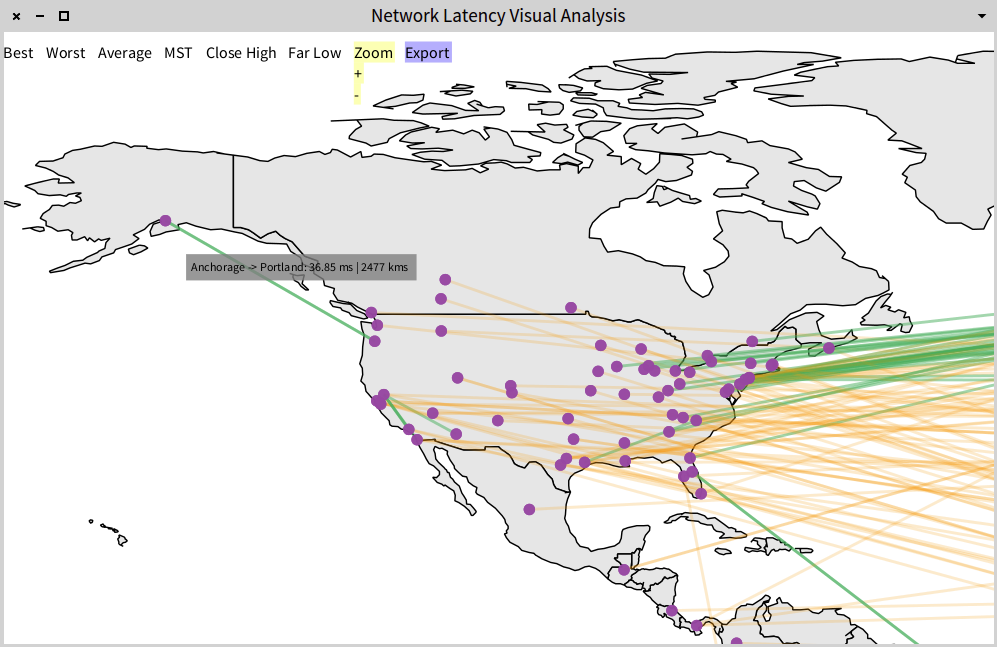
There is also another visualization which is not triggered from the menu. By left-clicking in any city (purple circles) the user can see the latency from that city to the other cities (included in the dataset).
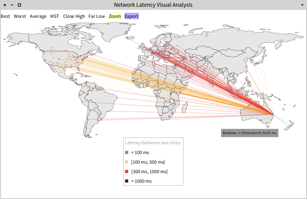
These visualizations show data which comes from a private company (see Resources) that offers a Internet Proxy service. The company shows the status of their service in its website from which the data was manually collected. The data can be inaccurate (the snapshot was taken at the end of 2014), so its only purpose is to be a proof-of-concept for showing how network latency data can be analyzed in a visual manner.
5. Visualizing your own connectivity
NLVA also includes a feature to allow users to test their own connectivity. To run it you have to right-click on the map approximately where your location is (the city can be already included in the map or not). A warning will popup asking you if you really want to run the test. It takes just a couple of seconds. It will show edges from your location to the rest of the cities included in the visualization (specifying their latency). A relevant analysis is to compare those results with the integrated data that comes with the tool ---caveat: it can only be done for the cities that come with the visualization (left and right-click).
