Charting, Plotting and Curving using Grapher
Graphing, plotting, and curving data points is essential when analyzing data. Roassal provides Grapher, an API implemented as a builder dedicated to building interactive charts. A graph is represented as an instance of the class RTGrapher. A set of data points is represented by an instance of the class RTData. A graph is therefore built by adding data sets in a grapher object.
This chapter first covers the different charts supported by Grapher. Subsequently, customization will be presented to fine-tune a chart.
1. Scatterplot
A scatterplot is a collection of Cartesian coordinates to display values for two variables in a data set. A scatterplot is a common way to represent bi-variate data.
1.1. Simple chart
Grapher offers a flexible way to draw scatterplots. Consider the following example, to be evaluated in a playground (Figure 1.1):
	b := RTGrapher new.
	ds := RTData new.
	ds dotShape color: Color blue.
	ds points: { 4 @ 5 . 10 @ 5 . 3 @ 2 }.
	ds x: #x.
	ds y: #y.
	b add: ds.
	b
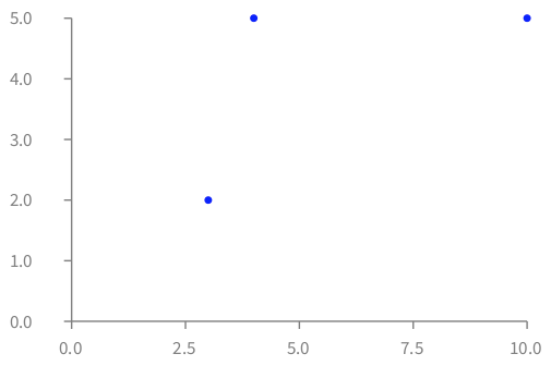
RTGrapher is created and assigned to the b variable. A data set is then created by instantiating RTData. We give as data point three points (we recall that 4 @ 5 corresponds to the point (4, 5)). Each data point is represented as a blue dot. A point in Pharo answers to the message x and y, which are specified using x: and y:. Each object data point provided to a RTData is evaluated using the argument of x: and y: to compute the corresponding numerical values. Finally, the data set is added in the grapher.
A data set for which each element has to be plotted using two functions, one against the X-axis and another against the Y-axis), is modeled using the class RTData.
Consider this slightly more elaborated example that relate earthquake depth and magnitude (Figure 1.2):
	tab := RTTabTable new input:  'http://earthquake.usgs.gov/earthquakes/feed/v1.0/summary/2.5_month.csv' asUrl retrieveContents usingDelimiter: $,.
	tab removeFirstRow.
	tab replaceEmptyValuesWith: '0' inColumns: #(4 5).
	tab convertColumnsAsFloat: #(4 5).

	b := RTGrapher new.
	ds := RTData new.
	ds interaction popup.
	ds dotShape color: (Color blue trans).
	ds points: tab values.
	ds x: [ :row | row at: 4 ].
	ds y: [ :row | row at: 5 ].
	b add: ds.

	b maxY: 8.
	b maxX: 700.

	b axisX title: 'depth'.
	b axisY title: 'magnitude'.
	b
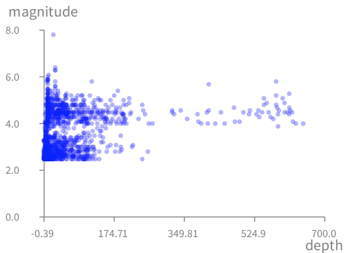
The code above fetches CSV data from a server. Try to open the used web address to see what the data looks like before processing it.
After having created the table RTTabTable, the first row, which contains the column names, is removed since it is of no use in this example. Columns 4 (depth) and 5 (magnitude) are converted into float numbers. The x value is obtained by fetching the 4th element of a CSV row, and the y value from the 5th element.
Note that the data set we use does not contain information about earthquake with a magnitude below 2.5.
Here is another example that visualizes application source code (Figure 1.3):
	methods := Collection withAllSubclasses flatCollect: #methods.

	b := RTGrapher new.
	ds := RTData new.
	ds dotShape circle color: Color red trans.
	ds points: methods.
	ds x: #numberOfLinesOfCode.
	ds y: [ :m | m getSource size ].
	b add: ds.
	b
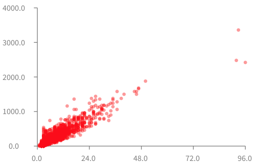
The variable methods contains all the methods of the Pharo Collection class hierarchy. Approximately 3,500 methods are defined in the collection class hierarchy.
Each data point is represented as a circle using the default size of 5 pixels, and colored with a translucent red. The collection of data points is specified using points:.
The x-value and y-value have to be computed for each data point. The number of line of code for a method is obtained with numberOfLinesOfCode. The block [ :m | m getSource size ] returns the number of characters of the method.
Figure 1.3 reveals an obvious correlation between the number of lines of code and the number of characters of the method. Deviation from the diagonal indicates methods with either very long or very short lines of code.
1.2. Multiple charts
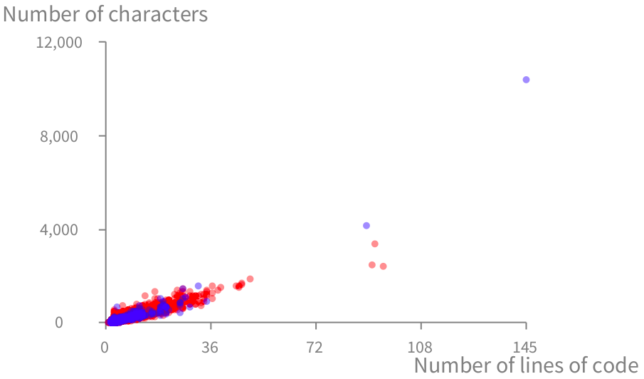
Grapher supports different data sets to be simultaneously displayed. Consider the following example (Figure 1.4):
	methods := Collection withAllSubclasses flatCollect: #methods.
	trachelMethods := TRObject withAllSubclasses flatCollect: #methods.

	b := RTGrapher new.

	"Data set 1"
	ds1 := RTData new.
	ds1 dotShape circle color: Color red trans.
	ds1 points: methods.
	ds1 x: #numberOfLinesOfCode.
	ds1 y: [ :m | m getSource size ].
	b add: ds1.

	"Data set 2"
	ds2 := RTData new.
	ds2 dotShape circle color: Color blue trans.
	ds2 points: trachelMethods.
	ds2 x: #numberOfLinesOfCode.
	ds2 y: [ :m | m getSource size ].
	b add: ds2.

	b axisX title: 'Number of lines of code'.
	b axisY title: 'Number of characters'.
	b
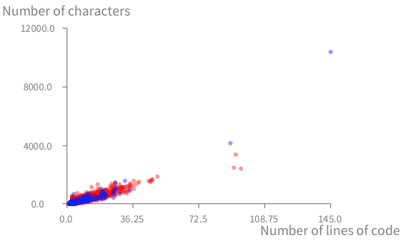
The first data set, the methods of the Collection class hierarchy (methods), is colored in red. The second data set, all the methods defined in Trachel (trachelMethods), are colored in blue.
1.3. Axis configuration
By default, the X and Y axes have four ticks, and each tick is labeled with a numerical value with a precision of one decimal point. Grapher however offers a number of options for configuring the axes. For example, in our situation, both axes are labeled with integer values: the number of lines and the size of method definitions are integer values. Consider the example seen previously, for which only integer values with a comma as thousand separators:
	...
	"Axis configuration"
	b axisX title: 'Number of lines of code'; noDecimal.
	b axisY title: 'Number of characters'; withThousandsSeparator.
	b
A number of options may be provided to an axis:
-
title:to specify a title to the axis. -
noDecimalto not have decimal on the axis. -
noLabelto not have any label. -
twoDecimalsto have two decimal numbers. -
withThousandsSeparatorto have a thousand separation in the labels. -
rotateLabelsto rotate the label by 45 degrees. Useful on the X-axis. -
decimal:to specify the number of decimal numbers to have. -
labelConversion:to transform the value being used in the axis. See the section on translating the Y-axis.
The complete list of options to configure axes is given by the class RTAxisConfiguration. Browse it for an overview of the different options.
2. Curve
A curve is obtained by connecting data points with a line.
2.1. Function
Consider the following script:
	b := RTGrapher new.

	ds := RTData new.
	ds noDot.
	ds points: (0 to: 3.1415 * 5 by: 0.01).
	ds y: #sin.
	ds x: #yourself.
	ds connectColor: (Color red alpha: 0.4).
	b add: ds.

	ds := RTData new.
	ds noDot.
	ds points: (0 to: 3.1415 * 5 by: 0.01).
	ds y: #cos.
	ds x: #yourself.
	ds connectColor: (Color blue alpha: 0.4).
	b add: ds.
	b
Note that #sin is rigorously equivalent to [ :v | v sin ], simply shorter.
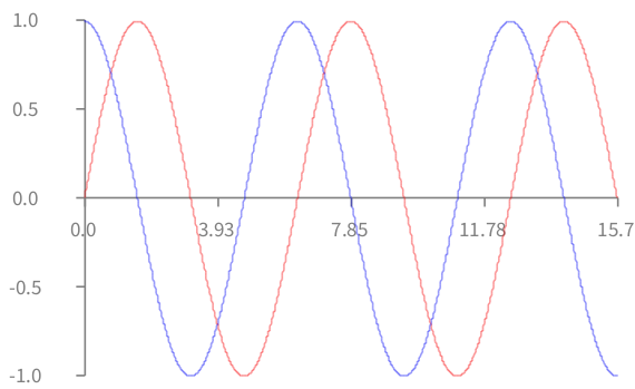
Grapher represents each data point with a dot in the visualization. In this example, the dots are not relevant. They are not part of the visualization, thanks to the message noDot. Instead, the data points are linked to each other using a connecting line, as defined by the new keyword here connectColor:. A line is drawn between the invisible dots in the order they were provided the points: keyword.
2.2. Stacking
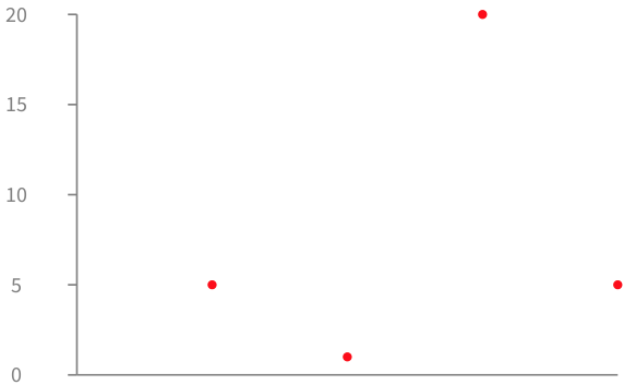
Data points may be stacked, meaning that the X value is not computed, but instead determined by the index in the collection. All the data points are therefore equally horizontally distributed. The following example shows 4 data points horizontally ordered in the same order as they were provided to points:, as seen in Figure 2.2.
	b := RTGrapher new.

	ds := RTData new.
	ds dotShape color: Color red.
	ds points: #(5 1 20 5).
	ds y: #yourself.
	b add: ds.

	b axisX noLabel; noTick.
	b axisY noDecimal.
	b
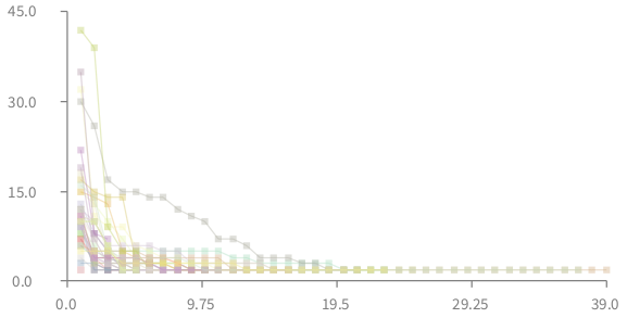
A slightly more elaborate example is given below. Each curve is a class contained in Roassal. Each data point is a method, sorted along their size, in a reverse order. The Y-value of a method is its size in number of lines of code.
	classes := RTShape withAllSubclasses.

	b := RTGrapher new.
	b extent: 400 @ 200.

	normalizer := RTMultiLinearColorForIdentity new objects: classes.
	classes do: [ :c |
		ds := RTData new.
		ds dotShape rectangle color: (normalizer rtValue: c) trans.
		ds points: (c methods reverseSortedAs: #numberOfLinesOfCode ).
		ds interaction popup.
		ds connectColor: (normalizer rtValue: c) trans.
		ds y: #numberOfLinesOfCode.
		b add: ds.
	].
	b
Figure 2.3 shows 27 different curves, each representing a subclass of the class RTShape.
A distinct color is given to each curve. This is useful for differentiating classes. To achieve this, a RTMultiLinearColorForIdentity object has to be initialized with the objects that will be colored. The message objects: is used for that purpose. The expression (normalizer rtValue: c) returns a color that is specific for the argument c.
2.3. Stacking or not stacking a data set
So far, a data set has been presented as a list of objects and two metrics specifying using x: and y:. The two values for each data point are then computed using the metrics.
A stacked data set is a data set for which only the list of objects and the y: metric are provided. The X value is determined using the list order.
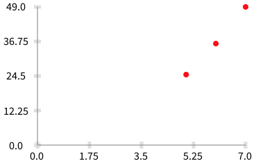
A scatterplot and a bar chart differently visualizes a data set. A bar chart needs a list of values to be represented (e.g., 5, 6, 7). A scatterplot needs a list of two coordinates (e.g., 2 @ 3, 5 @ 6).
Consider the following script:
	b := RTGrapher new.

	ds := RTData new.
	ds dotShape size: 8; color: Color red.
	ds points: #(5 6 7).
	ds x: [ :v | v ].
	ds y: [ :v | v * v ].
	b add: ds.
	b
Consider this slightly modified version:
	b := RTGrapher new.

	ds := RTData new.
	ds dotShape size: 8; color: Color red.
	ds points: #(5 6 7).
	ds y: [ :v | v * v ].
	b add: ds.

	b axisX noTick; noLabel.
	b
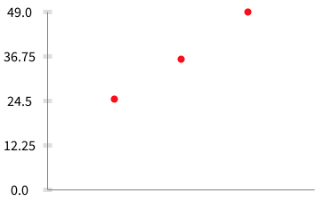
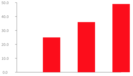
points:. Stacked data sets are useful in bar charts, as in the following example:
	b := RTGrapher new.

	ds := RTData new.
	ds barShape color: Color red.
	ds points: #(5 6 7).
	ds y: [ :v | v * v ].
	b add: ds.

	b axisX noTick; noLabel.
	b
2.4. Stacking multiple curves
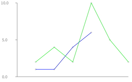
Consider two data sets #(1 1 4 6) and #(2 4 2 10 5 2) (Figure 2.7):
	points1 := #(1 1 4 6).
	points2 := #(2 4 2 10 5 2).

	b := RTGrapher new.

	ds := RTData new.
	ds points: points1.
	ds connectColor: Color blue.
	ds y: #yourself.
	b add: ds.

	ds := RTData new.
	ds points: points2.
	ds connectColor: Color green.
	ds y: #yourself.
	b add: ds.

	b axisX noLabel; noTick.
	b
The visual aspects of data points may be customized. Consider the following example.
	b := RTGrapher new.

	ds := RTData new.
	ds dotShape rectangle color: Color red.
	ds points: (RTShape withAllSubclasses sortedAs: #ageInDays).
	ds y: [ :c | c ageInDays ].
	b add: ds.

	ds := RTData new.
	ds dotShape circle color: Color blue.
	ds points: (TRShape withAllSubclasses sortedAs: #ageInDays).
	ds y: [ :c | c ageInDays ].
	b add: ds.

	b axisX noDecimal; title: 'classes'.
	b axisY noDecimal; title: 'age in days'.
	b
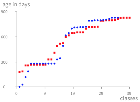
Figure 2.8 represents the age of shape classes contained in Trachel (i.e., subclasses of the class TRShape) and Roassal (i.e., subclasses of the class RTShape).
3. Labeled bar chart
Labels may be added in a bar chart. The instruction barChartWithBarTitle: allows for specifying a bar name computed from the data point. Consider the following example: (Figure 3.1):
	b := RTGrapher new.
	ds := RTData new.
	ds barShape color: Color red.
	ds points: #(-5 -9 10 -2).
	ds barChartWithBarTitle: [ :value | '##', value asString ].
	b add: ds.
	b axisX noLabel; noTick.
b 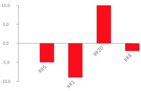
The angle of rotation may be set using barChartWithBarTitle:rotation:. Rotating labels is useful for avoiding overlapping labels.
In some situations, labels have to be centered. One could use barChartWithBarCenteredTitle: in that case (Figure 3.2):
	b := RTGrapher new.
	ds := RTData new.
	ds barShape color: Color red.
	ds points: #(-5 -9 10 -2).
	ds barChartWithBarCenteredTitle: [ :value | '##', value asString ].
	b add: ds.
	b axisX noLabel; noTick.
b 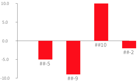
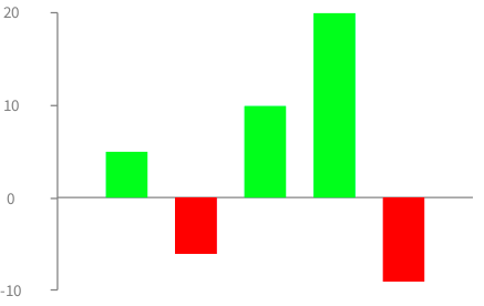
Bar may be colored depending on a specific value. Consider the following example (Figure 3.3):
	b := RTGrapher new.
	ds := RTData new.
	ds barShape
			if: [:v | v < 0 ] fillColor: Color red;
			if: [:v | v > 0 ] fillColor: Color green.
	ds points: #(5 -6 10 20 -9).
	b add: ds.
	b axisX noLabel; noTick.
	b axisY noDecimal.
	b
4. Interaction
Interactions may be defined to get particular behavior upon user actions. A typical case is getting a data point when the mouse is located above it. Per default, all the data points have the popup activated.
Sophisticated popup actions may give details about the pointed element. Consider the following code (Figure 4.1):
	b := RTGrapher new.

	ds := RTData new.
	ds barShape color: Color veryLightGray.
	ds points: (RTShape withAllSubclasses).
	ds y: [ :c | c methods size ].
	ds interaction highlightColored: Color red.

	ds interaction popup
		named: [ :c | c name, ' methods' ]
		background: Color lightBlue
		group: [ :group :element |
			| s ms |
			s := RTBox new size: #numberOfLinesOfCode; color: Color red.
			ms := element model methods sortedAs: #numberOfLinesOfCode.
			group addAll: (s elementsOn: ms).
			RTGridLayout on: group ].

	b add: ds.

	b axisX noTick; noLabel.
	b
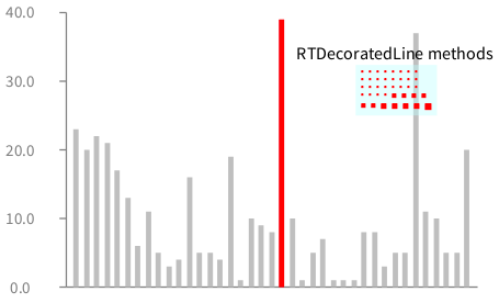
Two interactions are defined on each bar. First, the bar on which the mouse is above is red. The original bar color is restored when the mouse leaves the bar. The second interaction is a grouped popup, which has a name, a background color, and a set of method elements. The size of a method reflects the number of lines of code defining the method.
Note that this interaction is available for all kinds of charts.
5. Decoration
A chart often needs to be decorated, e.g., labeling particular values, adding an average, threshold. Grapher supports such operations thanks to a dedicated class hierarchy. All subclasses of RTAbstractGrapherDecorator describes a particular decorator.
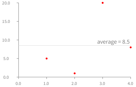
For example, a line indicating average may be added using (Figure 5.1):
	b := RTGrapher new.
	ds := RTData new.
	ds dotShape color: Color red.
	ds points: #(5 1 20 8).
	b add: ds.
	b addDecorator: (RTAverageDecorator new withLabel;
						labelConvertion: [ :aValue | 'average = ', aValue asFloat asString ]).
	b
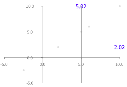
RTCursorFollower is a handy decoration that adds lines following the mouse cursor. Here is an example (Figure 5.2):
	b := RTGrapher new.

	ds := RTData new.
	ds points: #(5 10 6 2 -2.5).
	b add: ds.

	b addDecorator: (RTCursorFollower new color: Color blue).
	b
Color and the label computation may be parametrized. For example, the example above sets a color to the following lines and labels. The class RTCursorFollower offers the following configuration methods:
-
color:sets a color to the lines and labels -
labelXTextConvertion:andlabelYTextConvertion:allows for converting the text located along the cursor lines. Per default, the labels are set to display only two digits ([ :v | v round: 2 ]).
6. Translating the Y axis
Although it is usually not advised to have the label crossing at a different point than 0 @ 0, axis translation is supported in Grapher. Consider the following example:
	b := RTGrapher new.

	d := RTData new.
	d points: (0 to: 3.14 * 2 by: 0.05).
	f := [ :x | x sin + 4 ].
	d y: [ :x | f value: x ].
	d x: #yourself.
	b add: d.

	b
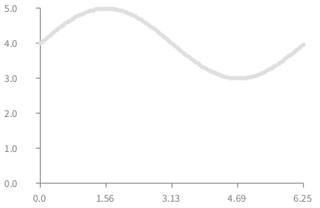
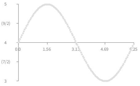
The translation along the Y-axis is realized by modifying the function provided to y: and using a labelTranslation:. Consider a new version of the script given above (Figure 6.2):
	b := RTGrapher new.

	d := RTData new.
	d points: (0 to: 3.14 * 2 by: 0.05).
	f := [ :x | x sin + 4 ].
	d y: [ :x | (f value: x) - 4 ].
	d x: #yourself.
	b add: d.
	b axisY
		labelConversion: [ :y | y + 4 ].
	b
Translating the X-axis to Y = 4 is done by subtracting 4 to the function provided to y: and summing 4 to the function provided to labelConversion:.
7. Date on the axis
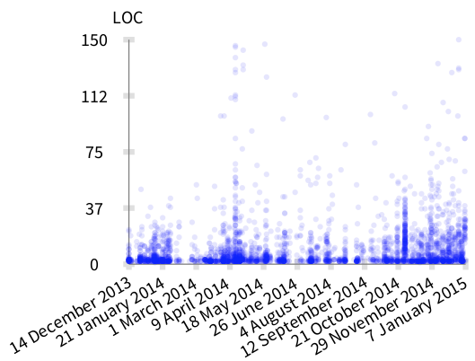
Dates are particular values that require an adequate control over what is being displayed on the X-axis. This is enabled using the julianDayNumber message on a date object, converting it into a number.
Consider the following example that shows the creation of methods along time (Figure 7.1):
	methods := RTObject withAllSubclasses flatCollect: #methods.
	methods := methods reject: [ :m | m numberOfLinesOfCode > 150 ].
	oldestMethod := methods minFor: #date.

	b := RTGrapher new.

	ds := RTData new.
	ds dotShape circle size: 5; color: (Color blue alpha: 0.1).
	ds interaction popup.
	ds points: methods.
	ds y: #numberOfLinesOfCode.
	ds x: [ :m | m date julianDayNumber - oldestMethod date julianDayNumber ].
	b add: ds.

	b axisY title: 'LOC'; noDecimal.

	b axisX
		title: '';
		labelRotation: -30;
		numberOfTicks: 10;
		numberOfLabels: 10;
		labelConversion: [ :v | (Date julianDayNumber: v + oldestMethod date julianDayNumber) ].
	b
8. Several metrics per data point
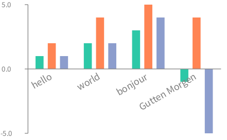
The class RTMultipleData provides a way to handle more than one metric per data point, represented by grouped bars. Consider the following example (Figure 8.1):
	b := RTGrapher new.

	d := RTMultipleData new.
	d barShape color: Color blue.
	d points: #( #('hello' 1 2 1) #('world' 2 4 2) #('bonjour' 3 5 4) #('Gutten Morgen' -1 4 -5)).
	d addMetric: #second.
	d addMetric: #third.
	d addMetric: #fourth.

	"Rotated text"
	d barChartWithBarTitle: #first rotation: -30.

	b add: d.

	b
There are two ways for doing naming groups of bars. On the example above labels begins on the central element of each group and is rotated. An alternative is to use barChartWithBarCenteredTitle: which use a horizontal label.
9. Adding a legend
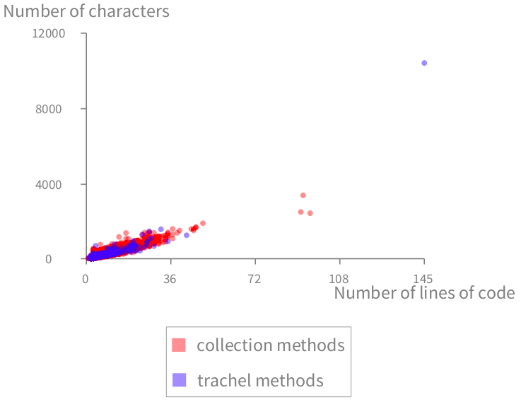
A legend often plays a significant role in the adoption of a visualization. Grapher supports a simple and expressive way to add a legend. Each RTData can have a title. Sending the message legend to the grapher returns a legend builder (described in the following chapters).
Consider the following example (Figure 9.1):
	methods := Collection withAllSubclasses flatCollect: #methods.
	trachelMethods := TRObject withAllSubclasses flatCollect: #methods.

	b := RTGrapher new.

	"Data set 1"
	ds1 := RTData new.
	ds1 label: 'collection methods'.
	ds1 dotShape circle color: Color red trans.
	ds1 points: methods.
	ds1 x: #numberOfLinesOfCode.
	ds1 y: [ :m | m getSource size ].
	b add: ds1.

	"Data set 2"
	ds2 := RTData new.
	ds2 label: 'trachel methods'.
	ds2 dotShape circle color: Color blue trans.
	ds2 points: trachelMethods.
	ds2 x: #numberOfLinesOfCode.
	ds2 y: [ :m | m getSource size ].
	b add: ds2.

	b axisX title: 'Number of lines of code'; noDecimal.
	b axisY title: 'Number of characters'; noDecimal.

	"We build the legend, and indicate it has to be located below"
	b legend below.

	b
The legend summarizes the color and the title of each data set.
